Table of Contents
- Symbols vs icons
- Why iconicity feels self-evident
- Radiation as an iconic quantity
- The cost of non-iconic numbers
- People are craving iconic arithmetic
- Where I want to go with this
Most of the numbers that matter in modern life are invisible.
We argue about “data center water use” or “radiation dose” or “COVID risk” with numbers alone, and then we’re surprised when even careful people miss errors of a thousandfold. The problem isn’t that people are bad at math. It’s that most of our numbers aren’t self-evident.
What we need, more than ever, is iconicity.
Symbols vs icons
A symbol is arbitrary: it means whatever we all agree it means.
- The digit
3doesn’t look like three of anything. - The English word
treedoesn’t resemble an actual tree. - The unit
Ldoesn’t tell you how big a liter feels in the world.
An icon, by contrast, resembles what it stands for. It carries its own explanation inside it.
- A stick figure of a person is an icon for “person”.
- A pie chart slice that takes up half the circle is an icon for “one-half”.
- A little drawing of rocks tumbling down a slope is an icon for “falling rocks ahead”.
Examples

You can see a whole spectrum of “three-ness” in this classic example from iconic math, from raw marks and tallies through words in different languages to more abstract notations:
And you can see a similar spectrum for “house”:
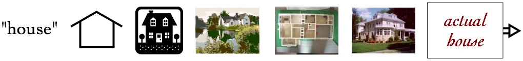
From the word “house” to a stick-house doodle to floor plans and photos: a spectrum from symbol to icon to the actual thing. At the far end of the spectrum are marks that almost are the things they stand for. Long before writing systems, as far back as 230,000 years ago, people in places like Cueva de las Manos in Argentina were literally tracing their hands on rock walls:

In that sense, iconicity is the font from which shared meaning must have originated: before we could agree that an arbitrary squiggle meant “tree” or “three”, we had to point, draw, and gesture at marks that actually looked like the things we had in mind.
There’s a whole spectrum between pure symbol and pure icon. What I’m calling iconic arithmetic is about pushing more of our important quantities toward the iconic end of that spectrum.
(If you want to see some lovely examples of this spectrum applied to math itself, check out iconicmath.com — they have diagrams where the "notation" for a fraction looks like the fraction.)
Why iconicity feels self-evident
Icons aren’t just “easier to understand”. They’re self-evident in a way that symbols almost never are.
When you see:
7/8on a page, you have to remember what it means and how big that is.- a pie that’s almost completely filled, you can see what it means, even if you don’t know the words “seven eighths”.
The second one gives you built-in sanity checks:
- If someone calls that “one quarter”, it looks obviously wrong.
- If you try to add three of those pies and get something smaller, it looks obviously wrong.
Iconic representations keep you from wandering too far into nonsense, because the nonsense stops looking like the picture.
This is also why old-school “proofs without words” are so satisfying. Once you’ve seen them, the algebra they stand for becomes hard to forget:
 A visual proof that the sum of the first n odd numbers forms an n×n square.
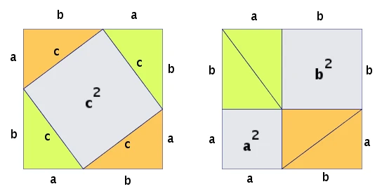 A classic rearrangement proof of the Pythagorean theorem using squares on the triangle’s sides.
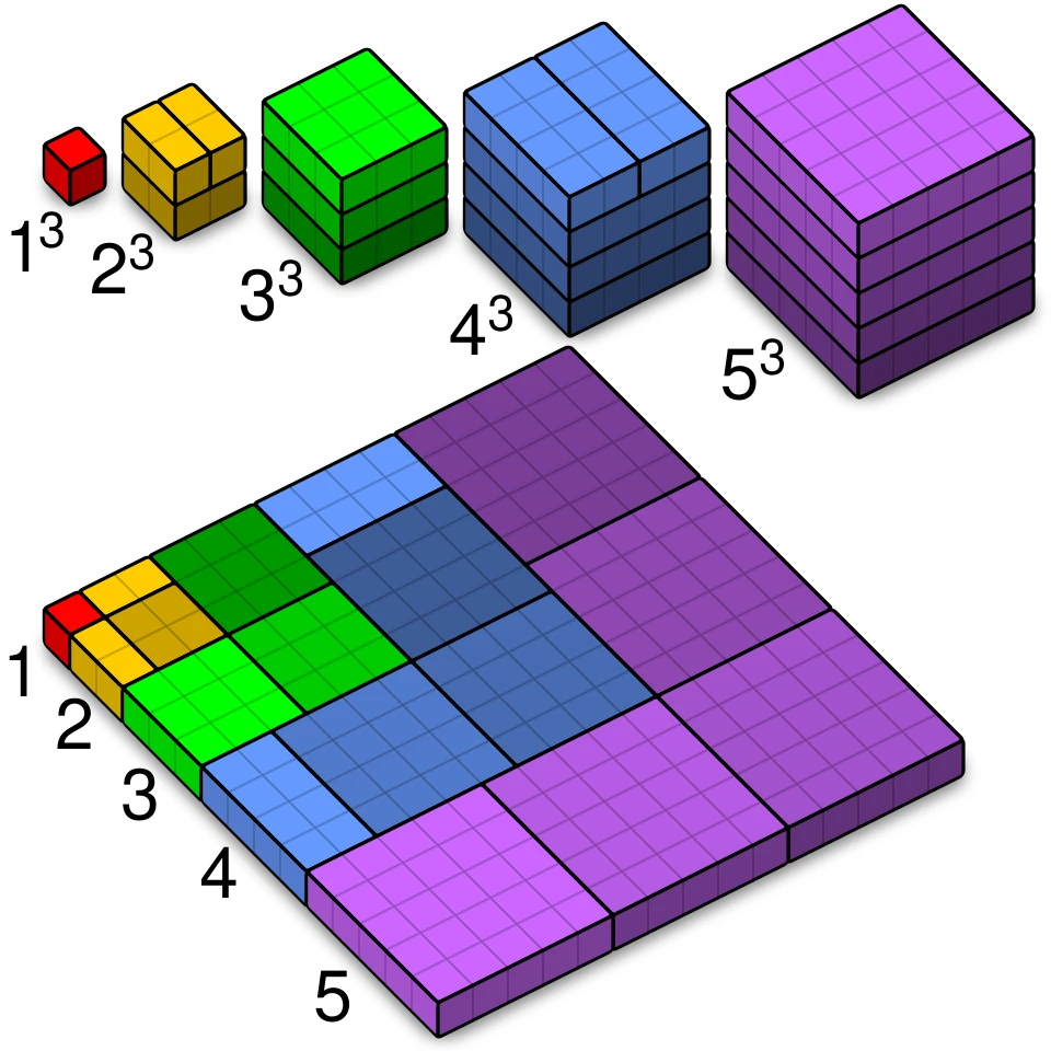 A diagram showing that the sum of the first n cubes forms a square of the nth triangular number.
Shamelessly taken from Wikipedia's Proof without words.
Radiation as an iconic quantity
Randall Munroe’s Radiation Dose Chart is one of my favorite examples of iconicity done right.
Radiation dose is one of those quantities that is:
- Hard to intuit from numbers alone.
- Genuinely important for public decisions.
- Constantly misrepresented.
The chart lays out common radiation exposures on a single visual scale: background radiation, a dental X-ray, a CT scan, a flight, Chernobyl, and so on. You see the doses as bars and clusters, not just as microsievert statistics.
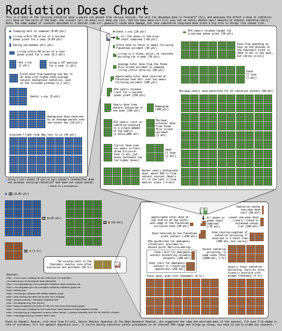
That chart does three important things:
- It gives you anchors — familiar experiences to hang numbers on.
- It shows relative scale — how many “X-rays” fit inside “CT scan” or “Chernobyl”.
- It builds in sanity checks — if someone claims that a banana gives you more radiation than a CT scan, you instantly know something’s off.
After you’ve internalized that picture, lots of arguments about radiation become much harder to get completely wrong. You’ve moved from a symbolic grasp of the numbers to an iconic one.
The cost of non-iconic numbers
Contrast that with a recent example from AI and water usage.
A government document in Chile appears to have labeled water consumption numbers as “liters” when they were actually “cubic meters” — off by a factor of 1,000. A bestselling AI book used those numbers in a comparison between a proposed Google data center and the city’s water consumption.
Those figures then passed through:
- a government agency,
- a journalist and editor,
- a fact-checking process,
- tens of thousands of readers,
before an outside analyst, Andy Masley, ran a sanity check and noticed the scale was wildly off, forcing a retraction.
Everyone involved was smart. There was real effort and care. But at no point did the quantity become visibly wrong in the way that a bad pie chart, or a bad radiation graph, would.
If there had been a simple “water usage chart” in the book — think “Radiation Dose Chart, but for liters per year” — a 1,000× mistake would have produced a grotesquely huge or tiny bar. It would have looked silly on sight.
That’s the cost of non-iconic numbers: we’re flying blind on scale, even when the underlying data is straightforward.
People are craving iconic arithmetic
You can see the hunger for this everywhere once you start looking.
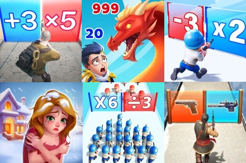
- People genuinely want to play simple arithmetic puzzle games (see the wildly popular, misleading ads for mobile games that promise “just do the math pipes!”).
- XKCD-style “explainers” go viral because they finally give people a way to picture quantities that were previously just scary numbers.
- When someone posts a good, honest “scale of X” graphic — for emissions, for wealth, for hospital capacity — it spreads far beyond the usual numeracy nerds.
These are all small glimpses of iconic arithmetic: numbers that come with their own sense of scale baked in.
Where I want to go with this
I think we need a lot more of this:
- Standard, shared “scale charts” for water, energy, risk, and money, the way we now have for radiation.
- Math notations and teaching tools where the marks on the page look like the quantities they describe, not just their names.
- Interfaces — including the ones I’m building — where big mistakes in scale are hard to make because they look wrong the moment they appear on screen.
Here’s a tiny example from a prototype I’ve been working on, a little toy world called House of Bao:

It’s not a full game yet, just a basic demonstration of some “axioms” of iconic arithmetic: things exist as piles and tokens on a grid; operations move and combine them in ways you can see. The whole point is that you shouldn’t need to read a HUD or a spreadsheet to tell what’s happening — your eyes should be enough.
This post is just a sketch. In future pieces, I want to dig into:
- ongoing development of House of Bao
- more examples of the demand for iconic arithmetic
- concrete design patterns for self-evident quantities and logic
For now, I’ll leave you with this: the revolution will not be symbolized. If we want people to reason clearly about the world, we have to give them representations that make the important quantities impossible to misunderstand.